BRANDING CASE STUDY | HAZELNUT PHOTOGRAPHY
As a Sage Wedding Pros Branding Specialist, I was invited to share a “before and after” of one of my latest branding projects. I think it’s important to see the design process from concept to completion, and how it comes to life.
Reposted from original: From time to time we’ll be inviting one of our Sage Branding Specialists to share some of their “before and after” design work with us. By learning from these case studies you’ll be better able to see branding identity go through an evolution, gain strength, and come to life.
Today, Jordan Peister, owner of Mintwich Design, shares with us her rebrand of Hazelnut Photography. Here, Jordan shares her process of creating identity to match the company’s image and creativity.
BEFORE THE REDESIGN
As a successful wedding and boudoir photographer, Jordana Hazel is her brand. She is talented and creative which is why I was thrilled to get the chance to help bring her new brand to life and make it reflect her style and creativity.
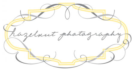
This is Jordana’s previous logo:
INSPIRATION FOR THE REDESIGN
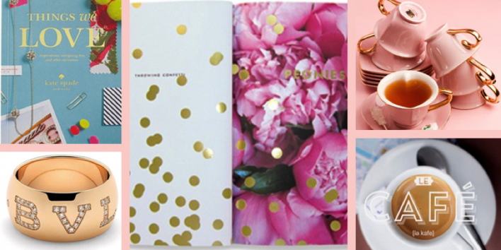
Knowing Jordana as a friend prior to the redesign shed light on how she is an exceptional photographer and has style with flair. Her love of all things French, sparkly accents, entertaining, designing and renovating her amazing Hollywood Tudor all played into the creative process. It is important that the brand makes someone say, “of course!” when they meet Jordana in person.
BRAND DEVELOPMENT
The overall message that communicates Jordana’s personality, service, and business needed to convey a light, sophisticated, chic and polished boutique photography company. In the details it would be mostly feminine, with a splash of masculinity.
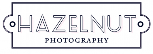
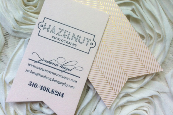
The redesign for Hazelnut Photography has to be one of my favorite projects. It’s elegant without being intimidating, clean, sleek and chic but not modern. It’s timeless, just like Jordana…and can we talk about her business card? I think they perfectly represent her persona. Arturo pale pink letterpress paper, deep navy ink, gold herringbone on the back and die cut edge for the ribbon. Stunning.
Originally posted here, thanks for reading!


Leave a Comment


- October 2018
- September 2018
- August 2018
- July 2018
- May 2018
- March 2018
- March 2016
- January 2016
- September 2015
- March 2015
- January 2015
- November 2014
- September 2014
- August 2014
- July 2014
- January 2014
- October 2013
- June 2013
- March 2013
- February 2013
- January 2013
- November 2012
- October 2012
- July 2012
- May 2012
