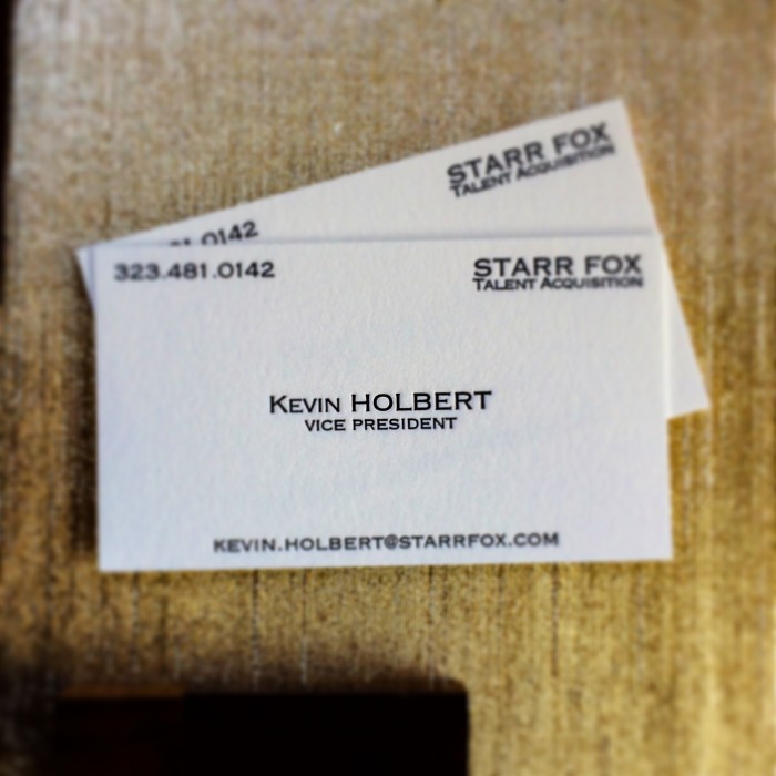
Some of the most simple designs leave the largest impact. Add in luxurious lettra paper and letterpress printing, you have a solid business card that anyone would envy. We love this classic design, based on one of the most important scenes in cinematic history, American Psycho.
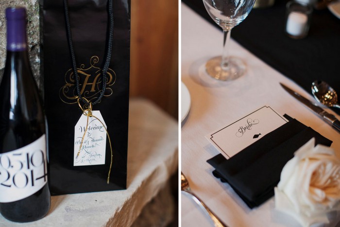
Some beautiful detail shots by Christina Szczupak Photography of our May wedding in Colorado. Paper goods by Mintwich Creative LLC, wedding planner You & Me Events, florals by Pink Posey Design.
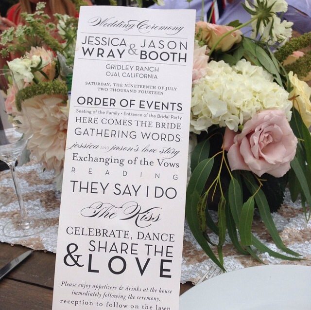
Here are some close-ups of this weekend’s wedding at Gridley Ranch. Soft neutrals and mixed textures, in love!
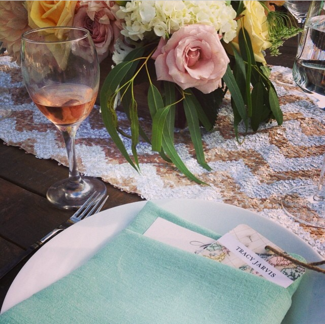
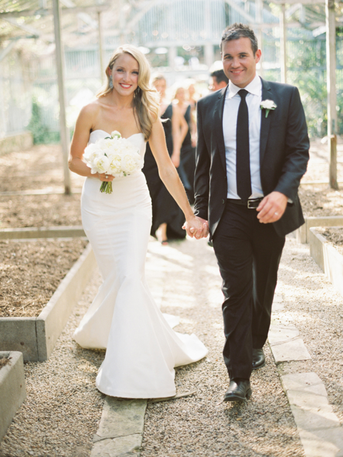
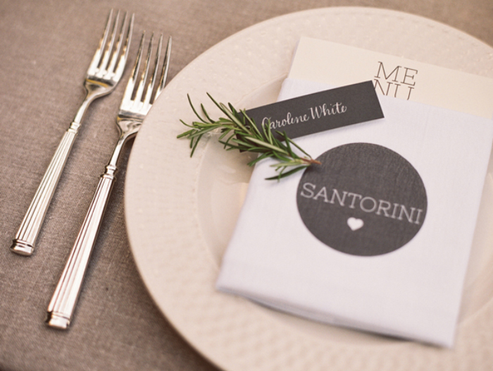
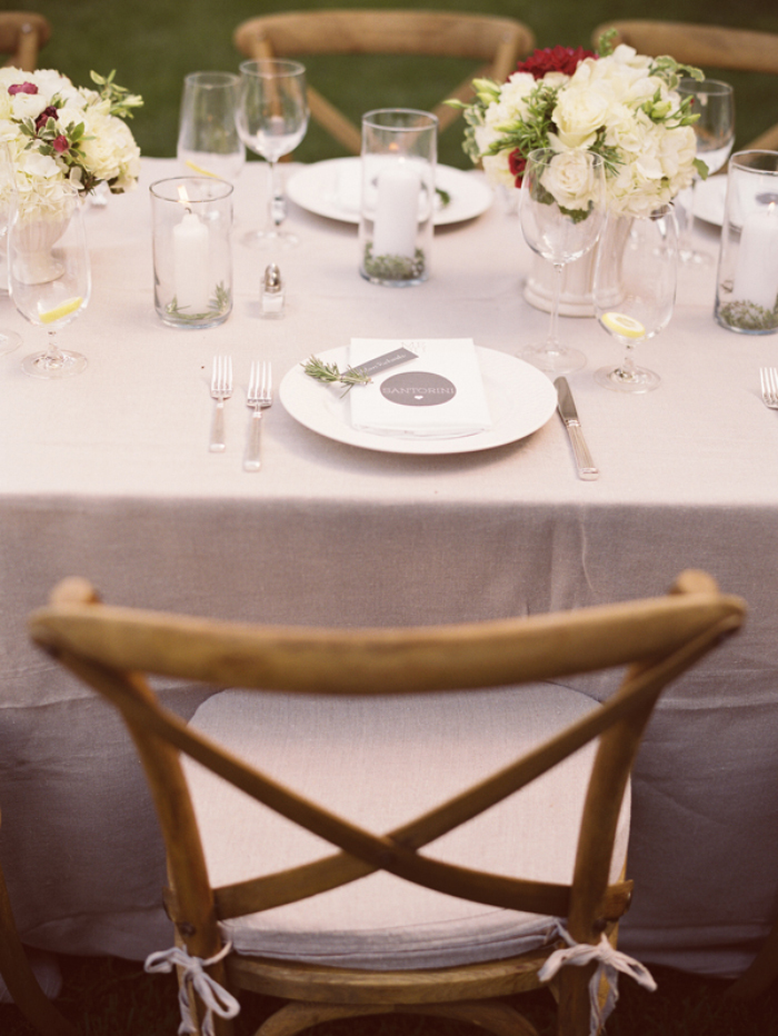
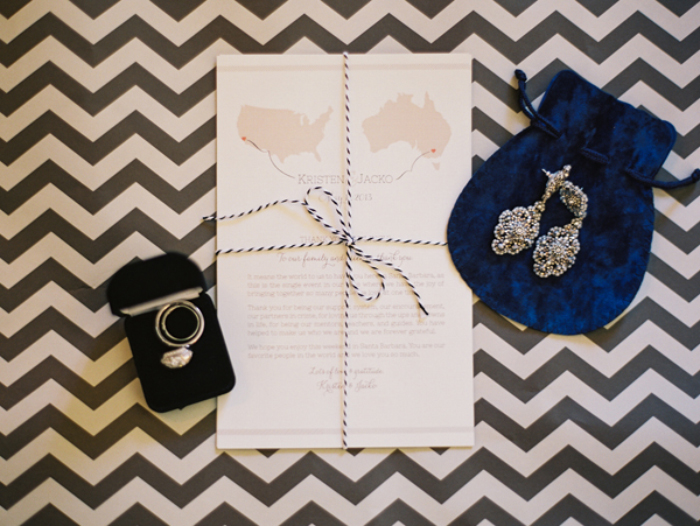
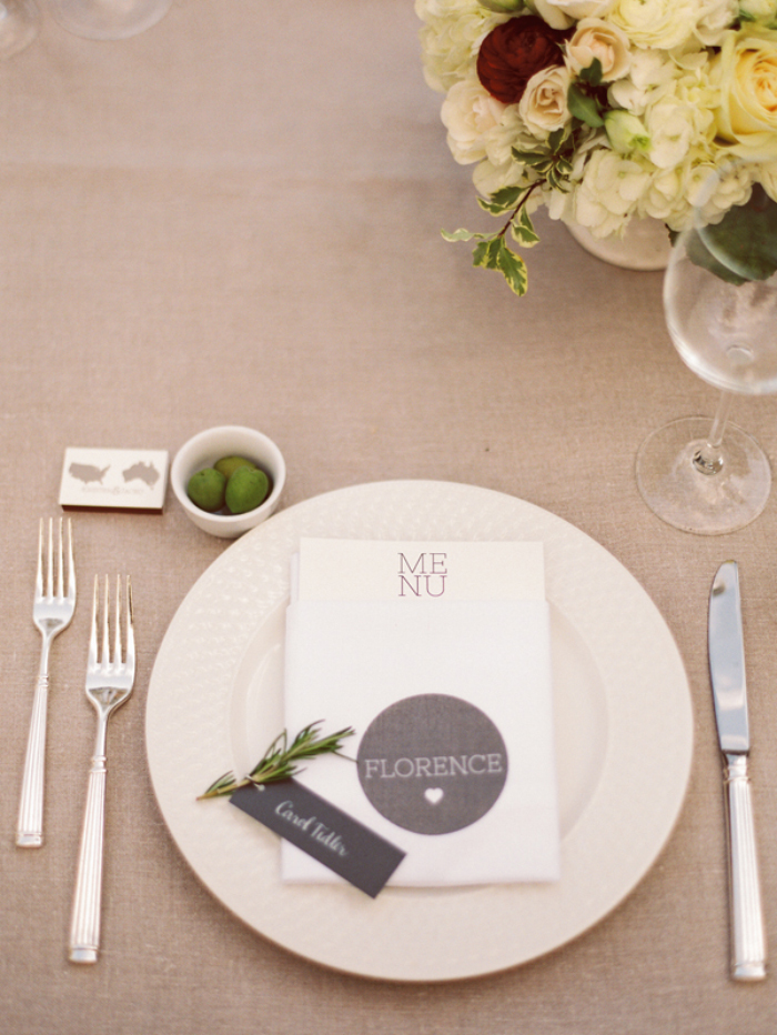
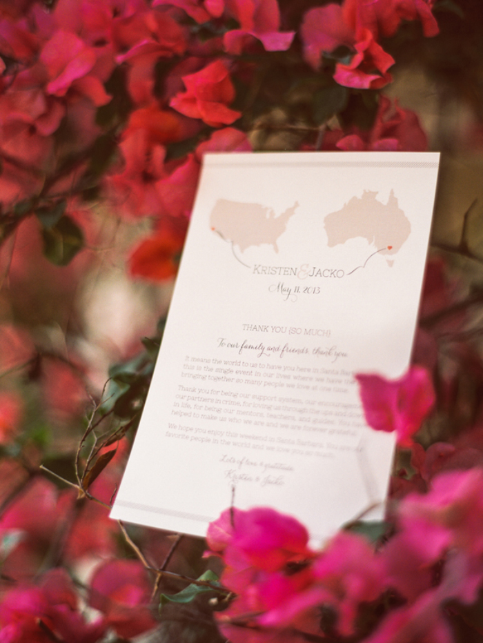
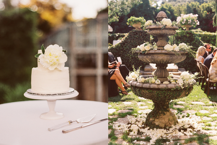
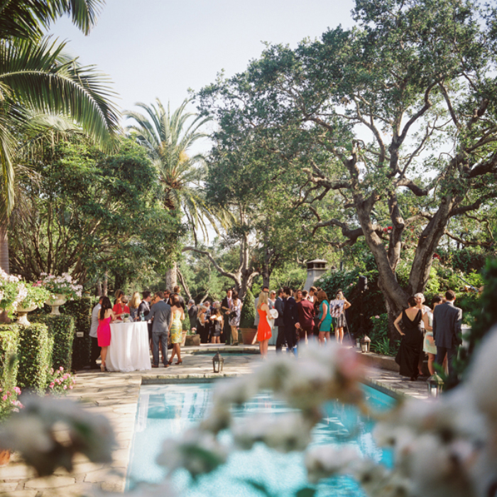
Kristen & Anthony were one of my favorite high-energy couples to work with. With Anthony being from Australia and their love for travel, the main inspiration for their Montecito Estate wedding was clear. The estate made you feel like you had escaped to Tuscany, the meal was served Italian family style, and the napkins with their most loved destinations all served as special details to celebrate with their friends and family. A dual country map reminded their guests of their international love and was the theme throughout the paper goods.
Check out more images in our feature on the Inspired By This blog.
Photography: Michelle Warren Photography / Event Design & Coordination: You & Me Events / Videographer: Brinton Films / Floral Design: Kate Baker Floral Design / DJ: Hey Mister DJ / Venue: Ravenscroft Estate, Montecito / Catering: Via Maestra / Paper Goods: Mintwich Design / Calligraphy: Laura Hooper Calligraphy / Hair and Make Up: Team Hair & Makeup / Rentals & Lighting: Town & Country / Linens: La Tavola
There are those occasional, if awkward, moments that many of us experience on the Internet, when we’re browsing for new music, inspiration, or even new clients, and we come across a page that … just … well, it looks like it hasn’t been updated since Excite was a major player in web browsing. It’s probably the case that this site has been long abandoned, but then … we’ll just hope it has been, anyway. Of course, there are those even more awkward moments, when we realize that the neglected site is our own. If this or any of these signs are familiar, it’s time to revamp your website.
If your site might be an offender, here is a guide of Seven Ways to Tell if Your Website Needs a Facelift.
1) Is your site compatible with all web browsers? The days of Internet Explorer’s market dominance are over, and if your site was launched five years ago with IE in mind, it might have some issues loading properly with other browsers, like Firefox, Opera, Safari, or the current market leader, Google Chrome. If this is the case, then it might be a good time to overhaul the site to improve functionality.
2) Is your site mobile friendly? With more and more people using smart phones to browse the web, it is important to make sure your site has a mobile version or is mobile friendly.
3) Is your site heavy with Flash and other trends? Flash graphics interfere with search engines and is also not viewable on the iPad or Android based tablets.
4) Is your site easy to navigate? If potential customers have a difficult time finding useful information on your site, they’ll get frustrated and leave for a competitor’s. A simple rule is that it should take potential clients no more than three clicks to find information they’re looking for.
5) Is your information up to date? If your business has changed its location, management, or inventory, or even updated the contact info, it’s a good idea to make sure all of this is up to date on the site. If people see your old information online, they’ll be in for a frustrating drive when they head over to your old location, and if your phone number or email address is out of date, you risk losing potential business.
6) Beware of broken links on your site. If potential customers are browsing your site, looking over your products and find one of these pop up, they’re likely not to be pleased. Error pages can reflect poorly on the business and hurt the value of the brand.
7) Does your site show up in searches? The value of SEO phrases in the text on your site cannot be overstated. You want to drive traffic to your site, and the best place to start is to make sure it shows up in engines like web behemoth Google, but also in others like Yahoo and Bing.
Mintwich can help give your site the facelift it needs. We can improve any outdated designs, give it a crisp and clean appearance, improve its navigation, and help improve its SEO.
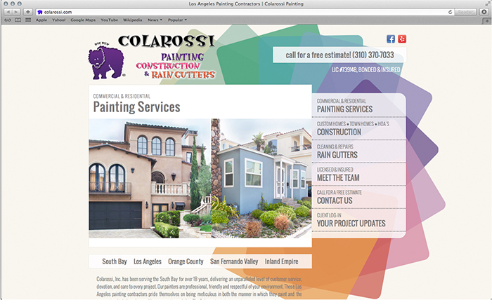
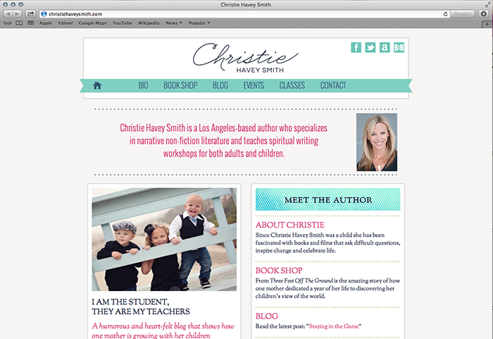
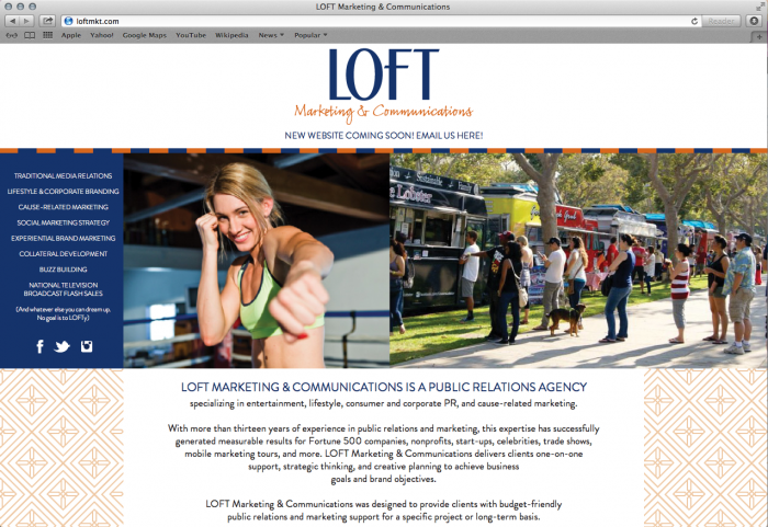
Check out a few of our website projects, or the full portfolio in our Lookbook!
I always enjoy helping my associates with the redesign of their websites. Elizabeth at Loft Marketing & Communications needed a facelift for her site. We’ve kept the same color scheme, but updated the logo and layout of her site. Stay tuned for the finished product!
As a Sage Wedding Pros Branding Specialist, I was invited to share a “before and after” of one of my latest branding projects. I think it’s important to see the design process from concept to completion, and how it comes to life.
Reposted from original: From time to time we’ll be inviting one of our Sage Branding Specialists to share some of their “before and after” design work with us. By learning from these case studies you’ll be better able to see branding identity go through an evolution, gain strength, and come to life.
Today, Jordan Peister, owner of Mintwich Design, shares with us her rebrand of Hazelnut Photography. Here, Jordan shares her process of creating identity to match the company’s image and creativity.
BEFORE THE REDESIGN
As a successful wedding and boudoir photographer, Jordana Hazel is her brand. She is talented and creative which is why I was thrilled to get the chance to help bring her new brand to life and make it reflect her style and creativity.
This is Jordana’s previous logo:
INSPIRATION FOR THE REDESIGN
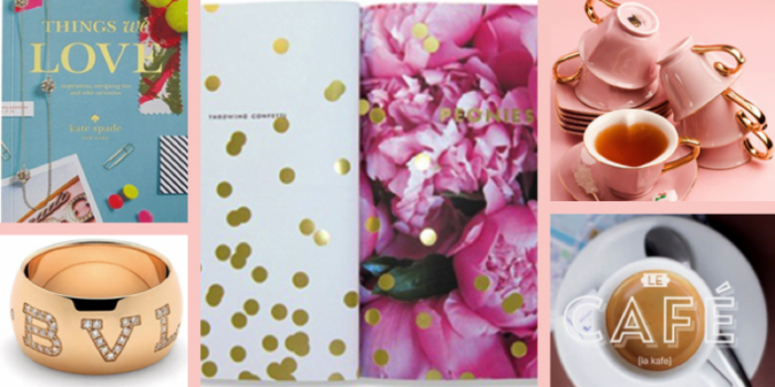
Knowing Jordana as a friend prior to the redesign shed light on how she is an exceptional photographer and has style with flair. Her love of all things French, sparkly accents, entertaining, designing and renovating her amazing Hollywood Tudor all played into the creative process. It is important that the brand makes someone say, “of course!” when they meet Jordana in person.
BRAND DEVELOPMENT
The overall message that communicates Jordana’s personality, service, and business needed to convey a light, sophisticated, chic and polished boutique photography company. In the details it would be mostly feminine, with a splash of masculinity.
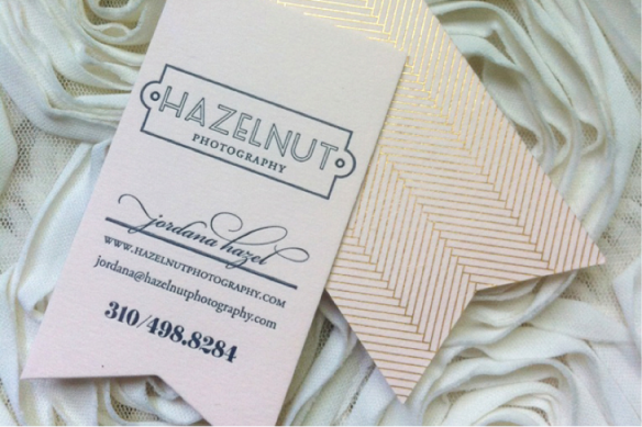
The redesign for Hazelnut Photography has to be one of my favorite projects. It’s elegant without being intimidating, clean, sleek and chic but not modern. It’s timeless, just like Jordana…and can we talk about her business card? I think they perfectly represent her persona. Arturo pale pink letterpress paper, deep navy ink, gold herringbone on the back and die cut edge for the ribbon. Stunning.
Originally posted here, thanks for reading!
- October 2018
- September 2018
- August 2018
- July 2018
- May 2018
- March 2018
- March 2016
- January 2016
- September 2015
- March 2015
- January 2015
- November 2014
- September 2014
- August 2014
- July 2014
- January 2014
- October 2013
- June 2013
- March 2013
- February 2013
- January 2013
- November 2012
- October 2012
- July 2012
- May 2012

