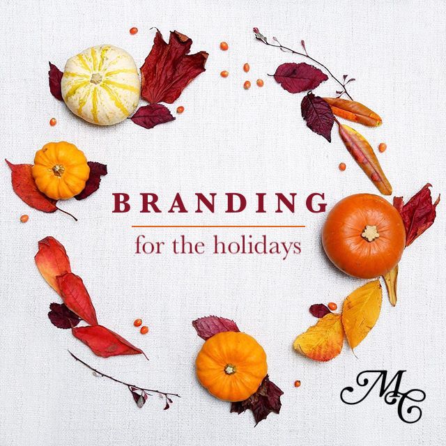
 ‘Tis the season. If you haven’t started feeling the heat of the holidays, enjoy this brief moment before the busyness sets in. Between hosting family, managing a social calendar full of holiday parties, and getting gifts purchased and wrapped, these final months of the year have a way of flying by. If you’re a business, however, you shouldn’t miss the opportunity. Dedicating some energy to branding during the holidays can help your business build rapport with your customers and stand apart from your competitors.
If you’re not sure you should bother with branding during the holidays, start paying attention to top brands. Most major companies will adjust their branding during the holiday season. You can see some great examples of holiday branding in this article.
But what if you’re not a global company with a massive marketing department who can manage your branding during the holidays? There are still some ways you can capitalize on this opportunity. Here are a few to get you started.
Leverage your existing branding.
Just because you want to do something interesting for the holidays doesn’t mean you can completely ignore your existing branding. Certainly, if your logo is already red or green, you might have an easier time creating marketing materials that use the colors of the season. But even if you’ve got blue, orange, yellow, or really any other brand colors, you can still do something fun and festive for the season. String some holiday lights over your packaging or logo, add a tree behind it, put a bow on top – your options for making your branding work during the holidays are virtually endless. All it takes is creativity and consistency. Don’t lose sight of your existing branding as you play with your seasonal designs.
Use your new assets.
Whether you come up with a catchy holiday tagline, roll out a seasonal package design, or come up with a holiday version of your logo, make sure it reaches the widest audience possible. People love the holiday season, and showing them you’re celebrating with them is a fantastic way to strengthen customer loyalty. Post your seasonal branding on your social media accounts, send out a holiday-based email campaign, and hang your new holiday branding up in your office. There’s no sense in creating these holiday assets if you’re not going to widely use them.
Revisit it next year.
After the holiday season, you’ll pack up your decor. When it comes time to decorate next year, you’ll probably set things up in a slightly different way. You’ll make improvements so your holiday home is even more impressive when guests come to call. Your branding is similar. If this is your first year branding during the holidays, don’t fret about doing something overly complex. Establish something simple this year, and you can revisit it next year to refine your vision and improve its reach.
Seasonal branding should be fun and festive – not frustrating. If you’d like help in creating meaningful brand assets for the holiday season, contact Mintwich Creative. We’re here to help you wow your customers during this exciting time of year.


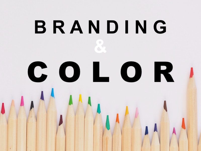 Whether you’re about to start your own business or you have an established brand you’re looking to freshen up, color is key. The colors you choose to use in your logo, on your website, and in all your other marketing material will shape people’s first impressions of your company. So choosing the right brand color or colors is critical. What feel do you want people to get from your brand? What message are you trying to send? Answering those questions and using this guide can help you choose the right brand color.
Here’s a quick look at what each brand color means:
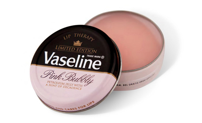
PINK
Pink is a surprisingly versatile brand color. Clearly, it has a feminine appeal, but it can be a useful color for a variety of brands depending on the saturation. A light pink also evokes feelings of softness, sentimentality, and even sensuality. A bolder pink is exciting and inviting; T-Mobile uses it well.
RED
If you want to convey a sense of power or passion, incorporate red. It carries with it energy that can inspire action. It can also come across as intimidating and, for that reason, many brands steer clear of it. However, that’s why red can help you stand out from your competition. The iconic Coca-Cola red is easy to spot on any shelf in any grocery store.
ORANGE
Orange is both enthusiastic and warm. It can help people feel drawn to your brand and feel motivated to take action. But it can also feel cheap. When used well, orange can inform prospects that your brand is affordable and approachable. It can run the gamut from masculine (e.g. Harley Davidson, Home Depot) to playful and childish (e.g. Nickelodeon).
YELLOW
If you want people to feel happy when they think about your brand, work yellow into your branding. It’s playful and energetic. But, be forewarned, it can be hard to see against white backgrounds so you’ll likely need to pair it with additional brand colors. For example, Ikea chose a navy pairing while Shell opted for red.
GREEN
Green is a versatile color. It carries with it a sense of growth and possibility, which is why fast-growing companies like Starbucks and Spotify have chosen it for their branding. It’s both refreshing and stabilizing. And, thanks to the prevalence of the eco-conscious movement, it can link you to being environmentally responsible.
BLUE
Blue is a brand favorite – and for good reason. It’s a calm color that conveys honesty, reliability, good communication, and logic. Because it’s such a preferred color, blue logos can get lost in the sea of other blue logos (Facebook, GM, HP, Ford, IBM, Pepsi, Skype, and GE, to name a few). If you go for blue, think through your shade carefully to ensure you stand out.
PURPLE
The color of royalty, purple has long been associated with luxury. It can also carry a sense of creativity and wisdom. Purple is less frequently used in logos so choosing it can help you set your brand apart. For example, Cadbury and Yahoo have both chosen vibrant purple hues to draw the eye. But, be advised, it tends to rank much higher with women than men. Know your target demographic before opting for purple.
WHITE
White symbolizes purity, simplicity, innocence, perfection, and cleanliness. It’s a favorite for products that have minimal ingredients (e.g. detergents like All Free & Clear) and brands that are looking for a streamlined, minimal aesthetic. Because white can’t stand on its own as most backgrounds are white, brands like Tesla and Cotton use white space to create a logo that captures the power of white but is easy to see.
BLACK
Black is sophisticated and luxurious. If you want your brand to feel adult and refined, work with black. It has an air of authority and feels exclusive, making it ideal for high-end brands. Think of Louis Vuitton and Chanel. It’s a strong, solid color but it can be easily glossed over when fighting for attention with bold, vibrant hues. When working with black, an interesting logo design that draws the eye is critical.
Ultimately, the brand color or colors you choose can make all the difference in the strength of your brand and how it’s perceived by your customers. If you want help developing branding that’s strong today and will stay impactful for years to come, contact Mintwich Creative. We have years of branding experience that we can put to work for you.
 When you think about your company’s branding, the first thing that comes to mind is probably your company’s logo. And that’s definitely a key piece, but your branding strategy should extend well beyond it. (If you want to get caught up on the basics of branding, check out this blog.) Knowing your brand is everything you do that shapes how a customer feels about your company, it seems like a major to-do to get your branding in order. So how do you know if your brand is strong enough? Let’s take a look.
Measuring the strength of your brand.
To understand your brand’s effectiveness, put yourself in the shoes of your customers. If they see a piece of branding from your company, will they instantly “get it”? Will it resonate with them? Will it help them understand what sets you apart from your competition? Every piece of your branding, from your logo to your website to any advertising you do, should capture your company’s unique values and value-add.
How to build a stronger brand: get clarity on your company.
Before you can start building a strong brand, you need to get clear on what kinds of messages your company wants to convey. Here are a few key questions to get your wheels turning.
- What are your company’s key products and services? List all qualities make them distinct from the competition.
- What values drive your company? How are those values apparent in your products or services?
- Does your company have a tagline or slogan? Is that tagline or slogan capturing the most important parts of your business?
- What is your target market? What kind of branding do the major players in your target market have? How can your company set itself apart from them?
- What is your company’s specialty or niche?
Having the answers to these questions can help you distill the most important parts of your company down. Knowing what differentiates you from the competition (e.g. innovation, customer support, reliability) and what really matters (e.g. environmental responsibility, community giveback) should inform you when creating a meaningful brand.
How to build a stronger brand: get clarity on your customer.
Now that you know what kinds of messages you want to convey, you need to think through to whom you want to convey them. It’s called a target audience for a reason; you need to understand them well enough to target them. Hone in on your target market by asking yourself these questions.
- What age ranges am I trying to reach?
- What income range is ideal for my products or services?
- Are there any specific occupations or group affiliations that I can target?
- Besides my company, what is my target audience likely to find interesting? Think through activities, events, other companies, and whatever else comes to mind.
As you get clarity on your target audience, you’ll be better able to focus your branding on them. If you were torn between two logos before, better understanding your customer should help you determine which is more likely to catch their specific attention.
Getting started.
Once you have the clarity you need, developing a good branding strategy comes down to careful crafting. Any messaging and designs need to share your company’s key message with your target audience. They should help you stand clearly apart from your competitors. A strong brand is a distinct, meaningful one.
Do you want help building your strongest brand? Contact Mintwich Creative. We have ten years of experience helping companies of all sizes create powerful brands that reach their customers with the right messaging.
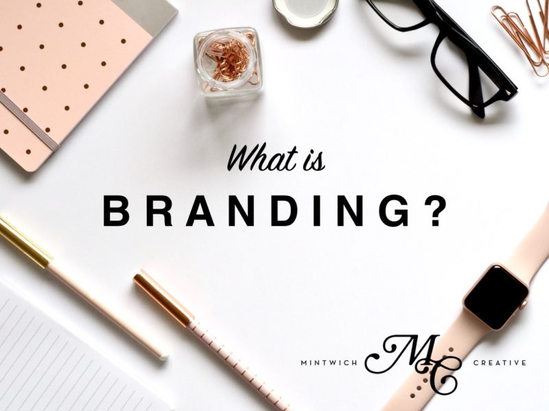
Branding. You hear a lot about it and likely have a vague idea of what it is and how it might impact your business. But are you confident about the way your brand is presented in every interaction with customers and prospects? Can you rest easy knowing you have strong branding in place?
What is branding?
To help you gain clarity, let’s talk about what branding means in 2018. It used to be captured in whatever identifies your business. That was probably a logo, but could also be a slogan or even a handful of colors. Today, branding is much broader. It’s the perception your customer has whenever he or she thinks of your company. How do you make your customers feel?
While branding used to just be a way to differentiate yourself from your competitors, it’s evolved. You can no longer have a set-it-and-forget-it mentality with your brand. Because good branding is integrally linked to customer perception, it needs to move and shift with their changing behaviors and beliefs.
Branding isn’t just an ethereal idea.
Many people, especially small business owners, think of branding as some intangible, floating idea. Sure, major corporations need to think about it, but is it really important for companies that aren’t running national ads or stocking product globally? Yes! Branding gives your business a purpose. When you have brand guidelines in place, it saves your business from loose, “anything goes” marketing, customer service, and more. Defining your brand gives every employee on your team clarity – and they can pass that clarity onto your customers, helping you stand out from your competitors.
What is a good brand?
A good brand identifies key messages about your company and identifies them clearly. Remember, it’s all about how your company makes your customers feel. Branding is essentially finding a way to make sure that at every customer touchpoint – whether they walk into your store, receive an email from you, call into your support desk, or simply see your logo – your customers are getting a consistent experience from your company. With brand guidelines in place, you ensure that your prospects and customers see the best parts of your company up front.
Do you want help understanding branding and establishing a strong brand for your company? Contact Mintwich Creative today! We have a decade of experience helping companies of all sizes develop and implement meaningful brands.
These guidelines will help you keep your branding consistent on social media.
Your business has a lot to manage. Keeping up your social media presence might feel like a low priority but you shouldn’t overlook it. An active presence on Facebook, Twitter, Instagram, etc. can help you put your business in front of a whole new audience!
When you post to social media, you want to make your business look its best. These tips will help you brand your social media, putting you in the best position to draw prospects and turn them into customers.
Be consistent with your messaging.
Image via Unsplash
Does your business have a voice established on social media yet? It can be confusing for people to see one post that’s playful and conversational, followed by one filled with professional jargon. Think about what kind of tone you use when you have a conversation with an exciting prospect. That’s the type of voice you should be using on social media. Once you establish your voice and messaging, keep it consistent no matter when or where you post. Someone who finds you on Twitter, then checks out your Facebook, should be quickly able to tell that your business has an established voice across both platforms.
Be consistent with your imagery.
Image via Bloguettes
First and foremost, make sure you’re choosing quality images to share on your social media accounts. No one likes looking at grainy, poorly-lit pictures! When you publish images to your social media accounts, think of them as representations of your business. Clear, bright photos are best. If you’re not sure where to get good images, Pexels and Unsplash are a couple of our favorites.
The most important imagery on your social media accounts is your profile picture. Make sure you’ve chosen one that captures your brand and makes your business look great! (Psst. We can help!)
Be consistent with your posting.
Image via Pinterest
If you’ve only ever posted to Facebook once, congratulations! You have a fresh start. Or maybe you have years of social posts on your business’s page. Either way, before you begin or continue publishing content, create a social media calendar for yourself. This sets you up for success and ensures that you’re not going to have months of silence followed by a barrage that will annoy your followers.
Branding your business online sets you apart from the competition and helps you make the most of social media. If you want to talk to a branding expert about how to best position your company across all digital platforms, contact Mintwich today!
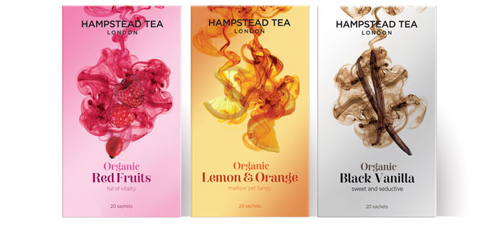
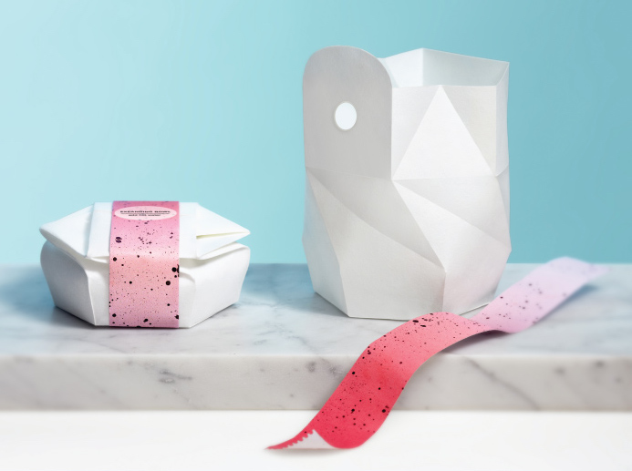
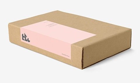
Good packaging is much more than just a pretty face.
Promoting your business can be tricky. Which platforms will give you the best exposure? What kind of advertising will most resonate with your audience? If you’ve put energy into marketing your products, these questions probably triggered a hundred more. With so much to consider, it’s easy to miss opportunities that are right in front of you. That includes your packaging. The way you package your products tells the world a lot about your business. Think of packaging as ad space you’ve already purchased.
How do you capitalize on this opportunity? Here are a few tips.
-
Know yourself and your audience.
The best packaging tells the world your business’s story. Brainstorm words or phrases that capture what makes your business unique. From that list, choose terms that are most likely to resonate with your target demographic. Keeping those words at the forefront during the design process will help you develop packaging that captures your brand.
-
Make it useful.
Good packaging is both beautiful and functional. Don’t stop at pretty. If you can make your product as nice to use as it is to look at, you’ve hit the nail on the head. Want to get inspired? Check out Mintwich’s Packaging Pinterest board.
-
Go green.
We live in an increasingly interconnected world. It’s easier than ever to see how everything is related. So it’s more important than ever for your brand to think about big-picture issues like sustainability and social responsibility. Consider going green when you choose packaging materials. Moving from plastic to more easily recycled or compostable glass and metal will help you show buyers that you value environmental responsibility, just like them.
-
Don’t limit yourself.
Think packaging is only for businesses that sell tangible products? Think again! There are plenty of opportunities for service-based businesses to benefit from these packaging principals, from business cards to the gifts you send to valued clients during the holidays.
Would your business benefit from expert packaging design? To make the most of this pre-purchased ad space, contact Mintwich Creative. My full-service design studio can help you find packaging that fits your brand and your budget. I’m here to beautify your product.
What makes Cynthia Rowley so fantastic? Why do I, as a graphic designer, feel drawn to her work?
The first thing you’ll notice is the geometrical lines – all those perfect right angles forming squares and rectangles everywhere. We are drawn to basic geometrical elements, because they are symmetrical, and human beings love symmetry. And right angles often form the foundation of good graphic design.


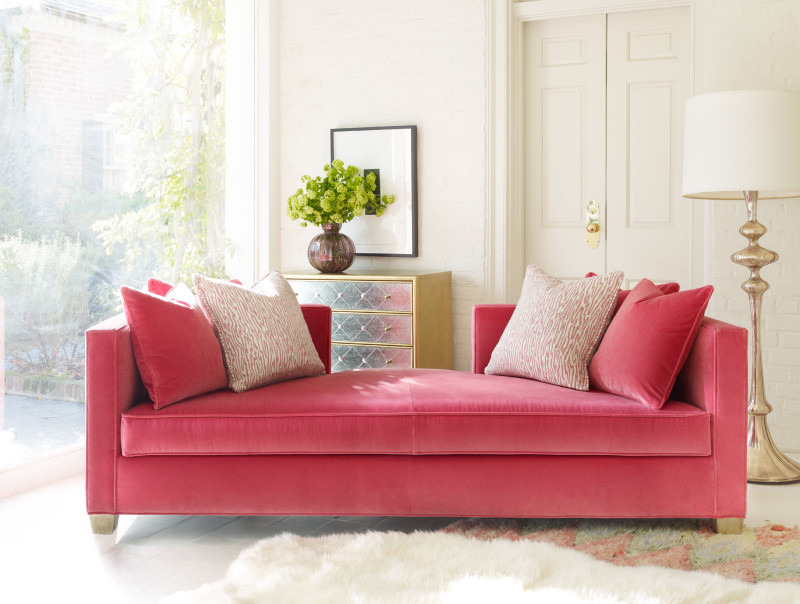
But just right angles can look so conventional. Too austere, too measured, too ‘designed.’ What Rowley does so masterfully is bring in elements that soften the geometry without undermining it. Look, for example, at her Balthazar upholstered bed. The marriage of such strong straight lines and right angles with gold metal and intense midnight blue plush fabric tones down the rigidity of the form. The same for the stunning pink daybed. With its spare geometrical lines, softened by pillows and an extraordinary color, the result is a showcase piece of timeless femininity.
Notice also how femininity is injected in her desk in black with impeccable geometry, is elevated with unexpected florals.
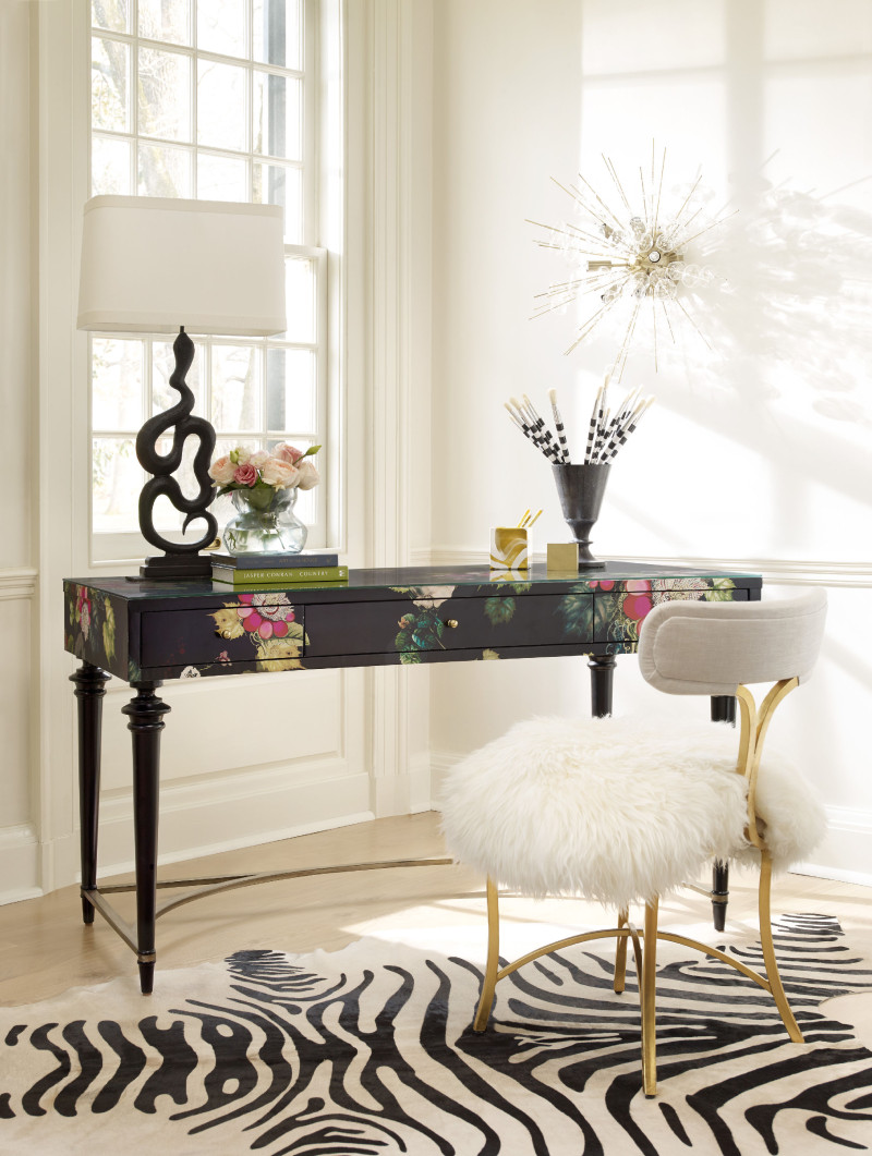
Geometry balanced with surprising, lush fabrics, colors and patterns is the hallmark of Cynthia Rowley’s design. The same elegant combination is what works in graphic design. Notice how the combination of luxurious gold and a rich navy offsets the strong lines of the menswear lookbook. Or how an organic bow works so well against the geometry of the packaging design of Ariel Gordon.
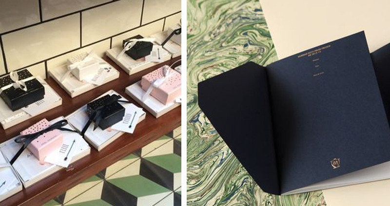
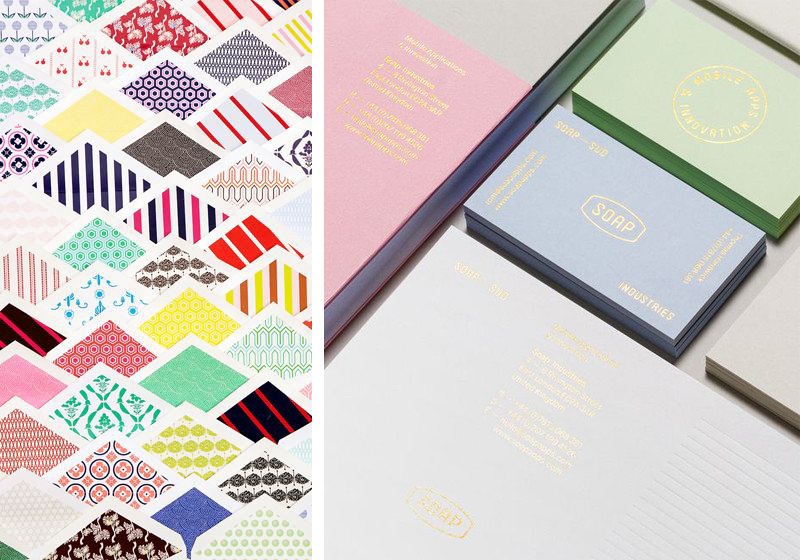
See how the whimsical patterns work with the strong symmetry of the charming Mr. Boddington envelopes, how the gold in the New York sign renders the repetitive symmetry opulent instead of spare. And how just a small rounded element in the Soap cosmetic packaging is enough to bring a feminine touch to moderate the masculinity of the strong straight design.

This aesthetic works beautifully in multiple graphic design projects, and it’s one I’ve drawn on for wedding invitations, food packaging, lifestyle products – brands that want to convey sophistication and elegance.